Slight change….

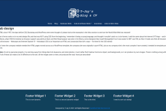
I felt that the completely black header/footers looked bad, so went for a more ‘techy look’ look. I also have created my logo using royalty-free images and font – and now the footer is now what we call in the industry as ‘dynamic’ that is, each of those columns can have ANYTHING that is text, or a plugin added to the template. Here is what the site now looks like on 23/12/2020.
It is cropped to look like what it should do ‘if’ everything is working properly – which at the moment isn’t!
